Poetic Perfection On The Page: Formatting Your Poetry For Kindle And Paperback

Poetic perfection on the page is becoming increasingly important to authors who are choosing to publish their work in both Kindle and paperback formats. As an editor, it is essential to understand the formatting of poetry that will be seen on the page. This article will explore the various elements of formatting that should be taken into consideration when preparing a poem for publication.
It is essential to ensure consistency in all facets of formatting, from line spacing and font size to indentations and margins. Attention must also be paid to the chosen style and structure of the poem itself, as this can affect the overall look of the piece once it has been published. By following these guidelines, authors can rest assured that their poems will appear in their desired format, regardless of the medium.
Key Takeaway
This article offers a comprehensive guide to formatting your poetry for both print and digital publication, ensuring it looks professional and polished. The key takeaways include the importance of setting consistent margins, line spacing, and font size and type, choosing the right indentation, and applying consistent spacing to create a harmonious design. Additionally, the article covers utilizing appropriate punctuation, understanding poetic structure and style, and editing for optimal results. By following these formatting guidelines, poets can present their work in the best possible light for Kindle, paperback, and other publishing platforms.
Recommended Action
Are you ready to make a profit from your passion? Don't miss our comprehensive guide on using Amazon to sell your poetry for all the information and resources you need to start selling your poetry!
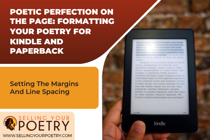
Setting The Margins And Line Spacing
When formatting a poem for Kindle or paperback, optimizing the layout is essential. This includes setting the margins and line spacing as well as including headers..
For Kindle, the standard margins are 0.75 inches at the top, bottom, and sides of the page. Line spacing should be set to one space in order to ensure that your poem looks neat and organized on the device. It can also be helpful to add a header with the title and author name so that readers can easily identify it when scrolling through their library.
In paperback format, you should adjust the margins accordingly based on your chosen size of the book; however, it is still important to keep them even throughout the text. Additionally, it is beneficial to include a header with both the title and author name in order to give your work more structure and organization. The next step is adjusting font size and type in order to create an aesthetically pleasing presentation of your poem.
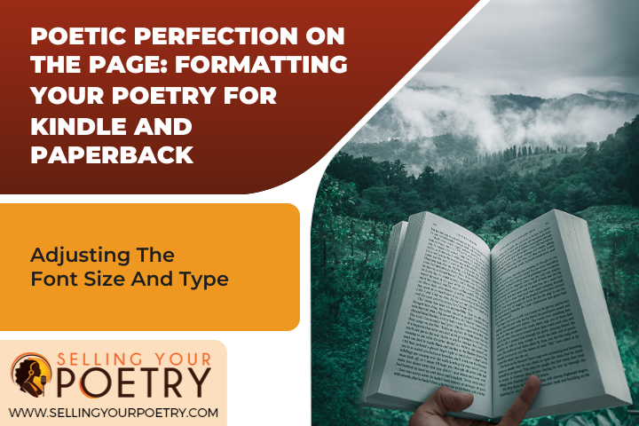
Adjusting The Font Size And Type
- When formatting poetry for Kindle and paperback, font sizing should be carefully considered since it is important to ensure that the poem is legible and easily readable.
- The various font sizes available should be evaluated, and the most suitable size should be chosen to ensure that the poem is presented in the best way possible.
- Font type is also a crucial factor to take into consideration when formatting poetry for Kindle and paperback.
- Different font types can bring out different qualities in the poem, such as its emotion and tone, and selecting the most appropriate font is essential for creating a visually pleasing poem.
Font Sizing
Font sizing is an important element in poetry formatting. Proper consideration of the font size and type can create a visually appealing experience for readers. When selecting a font size, one must consider the needs of both Kindle and paperback formats. For Kindle, the most common font sizes are 11 and 12 points, while paperback typically uses eight or ten points. Word choice also plays an important role in creating visual appeal; choosing words with clear definitions and appropriate length will help with readability and the overall presentation of your work. It is recommended that all selected fonts be easily distinguishable from one another to ensure clarity for readers as well as a cohesive look across all platforms. With careful attention to font size and type selection, readers are sure to enjoy a quality reading experience that showcases the author's work in its best light.
Font Type
In addition to font size, font type is another important factor when formatting poetry. When selecting a font, it should be readable across all platforms and easily distinguishable from other fonts and page elements. Selecting alternative fonts can add visual interest and help create a unique reading experience for readers. For example, using a bold font for titles or italicizing certain words can draw attention to specific parts of the poem. However, one must take care not to overuse these features, as too much emphasis on different fonts can create a chaotic page layout that detracts from the overall piece. By carefully considering both font size and type, authors can create an engaging reading experience that reflects their creative vision in an innovative way.
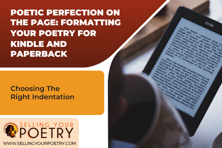
Choosing The Right Indentation
The art of formatting a poem for Kindle or paperback needs to be done with creative flow in mind. Appealing to the reader's visual layout is an essential element of poetic perfection on the page. Choosing the right indentation is key to creating a visually pleasing poem that will draw readers in.
The indentation of a poem should always be considered, ensuring that each line within stanzas also has a consistent indentation. This helps create harmony throughout the entire poem and enhances its readability. Furthermore, by using different spacing between lines within each stanza, it can add emphasis or rhythm to the words being expressed.
When it comes to formatting poetry on Kindle or paperback, experimenting with various levels of indentation and spacing will help bring out the beauty of each poem. With careful consideration of these elements, poets can achieve poetic perfection on their pages, resulting in an easily readable and visually attractive work of literature.
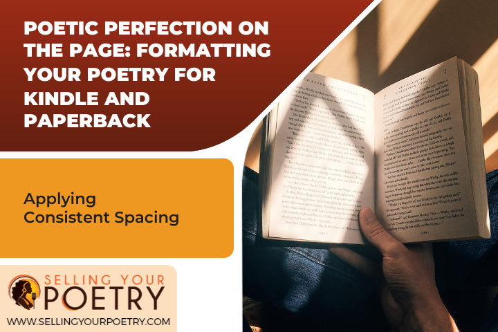
Applying Consistent Spacing
Spacing is an essential element of poetry formatting, as it helps create a visual appeal that guides readers through the text. When formatting for Kindle and paperback, strategic alignment of the words and lines should be a top priority. Here are three considerations for applying consistent spacing when formatting poetry:
Maintaining Even Margins: It is important to keep the margins even on either side of the poem so that it fits neatly into the page layout. If one margin is larger than another, this can disrupt the whole look and feel of your page.
Creating Line Breaks: Line breaks are an important part of creating rhythm in poetry, and they should be consistent throughout the piece. Make sure that each line break appears in exactly the same place in each stanza or verse so that it looks neat and organized.
Establishing Consistent Word Spacing: Word spacing should also remain consistent throughout your poem so that it looks uniform and attractive to readers. If you find that certain words appear too close together or too far apart, make adjustments until a balanced appearance is achieved.
By following these tips for applying consistent spacing when formatting poetry, you can ensure that your work has an aesthetically pleasing look that will draw readers in and keep them engaged with your writing.

Streamlining Your Design
When it comes to formatting poetry for Kindle and paperback, streamlining the design is a key step. As a poetry formatting editor, it's important to think of the design as an opportunity to create visual art that will draw in readers and communicate the message of the poem. Breaking the rules and pushing boundaries with creative visuals can help poets visualize their work in a new way.
Imagery is essential when streamlining a design. Consider using visual themes throughout each poem or book that are subtle yet effective in conveying the tone and story of the poem or collection. For example, if you're creating a collection of love poems, use light colors, like pink and white, to evoke an airy feeling of romance. Alternatively, you could utilize darker tones, like black and gray, for heartbreak-themed works.
Utilizing punctuation in creative ways can also add flair to your design. Consider incorporating special characters, like emojis or foreign symbols, into your work to make it more unique. It can be helpful to break up long lines by inserting line breaks when appropriate or by replacing periods with ellipses or question marks with exclamation points all great ways to emphasize certain aspects of your work while helping readers visualize the flow.
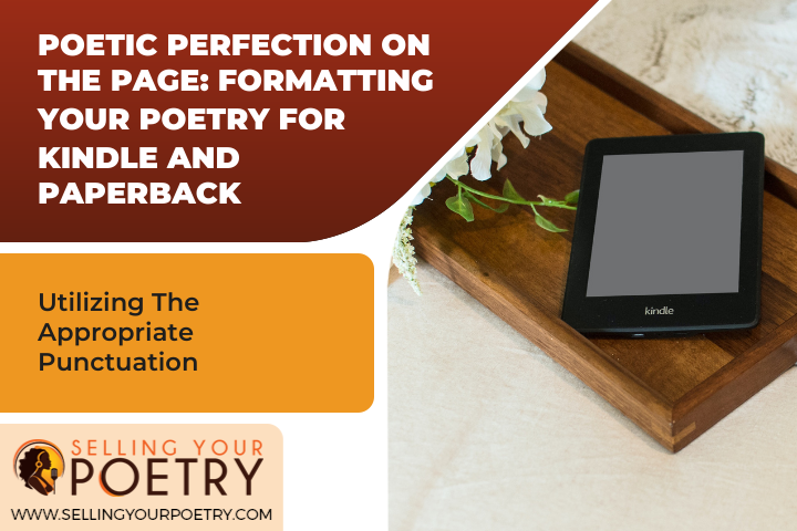
Utilizing The Appropriate Punctuation
The importance of punctuation in poetry formatting is often overlooked. However, it is these small details that can make a poem shine and captivate an audience. To create the optimal poetic experience, editors should consider the following when utilizing punctuation:
Embracing commas:
- Commas are key to creating rhythm and flow in a poem. They help guide the reader along and emphasize certain words or phrases while drawing attention away from others. In addition, they are essential for creating pauses or breaks in order to give readers time to reflect on what they have just read.
Embracing rhythm:
- Rhythm plays a vital role in poetry as it sets the tone for the entire piece. By combining long and short sentences with various types of punctuation, editors can help evoke an emotional response from their readers by creating a unique soundscape for them to enjoy.
Punctuation is an invaluable tool for formatting poetry and should not be overlooked. By embracing commas and rhythm, editors can ensure that their work will stand out from the rest and truly captivate their audience. As such, it is essential for all poets to take this into consideration when crafting their work. With this knowledge, one can move forward with confidence toward formatting their poems for both Kindle and paperback outlets with ease.

Formatting For Kindle And Paperback
Paperback formatting involves ensuring that line breaks, stanza breaks, and other elements are properly represented on the page. It is important to consider the physical size of the paper, the font size, and the overall layout of the poem in order to ensure that the reader's experience is as intended by the author.
Kindle formatting requires that all stanzas and line breaks are represented in the correct manner, as some formatting elements may not transfer correctly from original file types. Additionally, special attention must be paid to the overall presentation of the poem, as the reader may be viewing it on a device with a different size and shape than traditional paperbacks.
Paperback Formatting
The paperback format requires the arrangement of headers and choice of colors to be done in a way that not only accommodates the aesthetics of the poetry but also enhances it. A well-formatted work is sure to please readers, which is why taking extra care with the design elements when formatting for paperback is so important. Headers should be arranged in such a way that they provide structure for the poem both aesthetically and compositionally, and colors should be chosen to provide an atmosphere or tone that reflects the themes of the writing. In order to create a professional-looking design, it's important to make sure these elements are used judiciously and harmoniously in order to ensure that all elements on the page work together. Attention to detail will help make sure that readers have an enjoyable experience while reading your work, creating a lasting impression on them.
Kindle Formatting
When it comes to Kindle formatting, the main focus should be on creating an engaging and visually appealing reading experience. While many of the same design elements will apply as with paperbacks, there is an added layer of complexity when it comes to formatting for the Kindle. The font size, line spacing, and other elements must all be adjusted to ensure that the text is easy to read on a digital device. Additionally, the layout should be aesthetically pleasing while still providing structure to the poem and its themes. Visual design elements, such as images or illustrations, can also be incorporated in order to add more depth and interest to the work. Careful attention should be given when selecting fonts and colors in order to create a pleasant visual experience for readers. With these guidelines in mind, authors can create powerful works that effectively showcase their writing in a format suitable for both print and digital formats.

Understanding Poetic Structure And Style
Having explored the physical formatting of a poem for print and digital publication, we now turn our attention to the structure and style of poetry itself. Poetry is an art form that has been around for centuries, and its complexity is often underestimated. It requires an understanding of poetic meter, visual poetry, and other elements in order to craft a piece that is aesthetically pleasing to readers.
Irony can be used as an effective tool when writing poetry; it serves to create tension between the literal meaning of words and their implied meanings. This helps evoke emotion in readers, creating a powerful impact on them that will stay with them long after they've finished reading the poem.
For those who are new to writing poetry, it can be helpful to take time to familiarize oneself with different types of poetic structure and style. Researching traditional forms, such as haiku or sonnets, can offer valuable insight into crafting an effective poem. Additionally, exploring modern works by contemporary poets can help spark ideas for innovative ways to express one's creativity through words. With these tools in hand, writers are equipped with all they need to begin creating their own masterpieces.
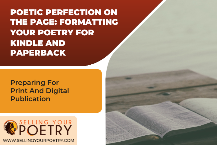
Preparing For Print And Digital Publication
When formatting poetry for print and digital publication, it is important to create templates that will appeal to readers. This can be done by researching current trends in the literary world, including the types of fonts and page layouts that are popular among readers. It is also necessary to consider how the text will appear on different devices, such as tablets and smartphones, as this can affect how easy it is for readers to access the content.
In addition to creating templates and researching trends, formatting poetry for print and digital publication requires an understanding of various production techniques. This includes choosing a paper size that best suits the poem's length and writing style and ensuring that images or diagrams are correctly sized for printing. Additionally, care should be taken when selecting typefaces that are legible on both digital displays and physical pages.
Once the format of a poem has been determined, careful editing is required in order to achieve optimal results. Editing should focus not only on spelling and grammar but also on ensuring the text flows smoothly from one line to another. The aim should be to produce a piece of writing that looks aesthetically pleasing while remaining true to the poet's vision. To ensure this is achieved, editors may need to make adjustments, such as adding or removing words or changing punctuation marks. With these steps complete, poets can then move forward with publishing their work either in print or digitally.

Editing For Optimal Results
Once the poem has been crafted and the formatting is complete, the next step in preparing it for print and digital publication is editing. Editing ensures that the written work meets the highest possible standards of quality and accuracy. It is essential to proofread text carefully before submitting it for publication, as any errors can impact both readers' impressions of the work and its overall success.
When proofreading a poem, there are several techniques that can be used to ensure optimal results. First, it is important to read the entire text aloud in order to identify any issues with flow or rhythm. The reader should also look out for spelling and grammar mistakes as well as any areas where clarity may be lacking. Additionally, checking for consistency in terms of language usage, punctuation, capitalization, line breaks, and page layout will help ensure that all elements of the poem are polished and professional.
Finally, reading over the finished product one more time provides an opportunity to double-check all aspects of the composition before submission. This gives the writer a chance to review their work from a fresh perspective and make any necessary corrections or adjustments. By taking all these steps into account when editing a poem for publication, poets can rest assured that their work will be presented perfectly on both digital platforms and in print format.
Frequently Asked Questions
What Is The Best Way To Format My Poetry For Print And Digital Publication?
When it comes to formatting poetry for digital and print publication, there are certain strategies that should be utilized in order to ensure a successful outcome. One of the most important considerations is to use a concise layout that will keep the reader engaged. Additionally, incorporating innovative design elements can further enhance the overall look and feel of the work, creating an aesthetically pleasing experience for readers. By following these tips and utilizing creative approaches to formatting, authors can ensure their poetry reaches its fullest potential both digitally and in print.
How Do I Make Sure My Punctuation Is Correct For Kindle And Paperback?
When it comes to formatting poetry for Kindle and paperback, punctuation is key. As the adage goes, "The devil is in the details," and nowhere is this truer than in poetry. Whether utilizing open verse or a specific rhyme scheme, proper punctuation can make all the difference in the readability of one's work. An experienced poetry formatting editor will be able to properly assess the needs of any poem before publication, making sure that each period and question mark is placed in exactly the right spot. With an eye for detail and a desire for innovation, they are best equipped to ensure your poem reaches its poetic perfection on the page.
What Are The Most Effective Techniques For Streamlining My Design?
Page layout is a key factor in producing an effective and aesthetically pleasing design. Editors of poetry formatting recommend streamlining the design by utilizing line breaks and page layouts to enhance the structure of the poem. Line breaks are particularly effective in guiding readers through the poem, allowing for space between verses and stanzas for a more organized reading experience. Utilizing page layout techniques, such as centering verses or using margins to separate different sections of the poem, can help create a more interesting visual presentation to draw readers in. By experimenting with these techniques, poets can unlock their creativity and inject innovation into their works, leading to poetic perfection on the page.
What Font Size And Type Should I Use For My Poetry?
Achieving poetic perfection on the page requires careful consideration of font size and type. When formatting for Kindle or paperback, editors suggest considering both the aesthetic appeal and the distinct poetic voice of the piece. While an overly large font may make a poem appear visually appealing, it can also detract from its poetic appeal. On the other hand, too small a font size can make it difficult to read and interpret line breaks. As such, it is best to choose a font size that will help bring out the unique character of your poem in a way that enhances its overall aesthetic impact.
How Do I Apply Consistent Spacing For The Optimal Results?
When formatting poetry for Kindle and paperback, consistent spacing is essential to achieving poetic perfection on the page. Line breaks and blank verse are key elements of a poem's composition that should be respected in any formatting process. To ensure optimal results, editors should carefully consider how line breaks are represented by the chosen font size and type. This may require some trial-and-error experimentation with font sizes and types, but it is, ultimately, necessary for achieving the desired effect of engaging readers with innovative formatting.

Conclusion
It is clear that formatting your poetry for both Kindle and paperback requires careful attention to detail. By following the best practices outlined above, any poet can achieve poetic perfection on the page. For example, when formatting a collection of poems, one should select a font size and type that are both practical and aesthetically pleasing. Additionally, consistent spacing should be utilized to create a visually appealing layout. Ultimately, these techniques are essential for creating an effective format for both digital and print publications.
What To Do Next
Take your poetry career to the next level by creating a professional online presence. Learn how to do so by visiting our article on setting up an Amazon Author page for step-by-step instructions and valuable tips.
Once you've published your poetry on Amazon, it's time to promote it effectively. Discover the best strategies and techniques by checking out our page on promoting your poetry on Amazon, filled with actionable insights and resources.